AstraZeneca Hub Redesign
The Problem
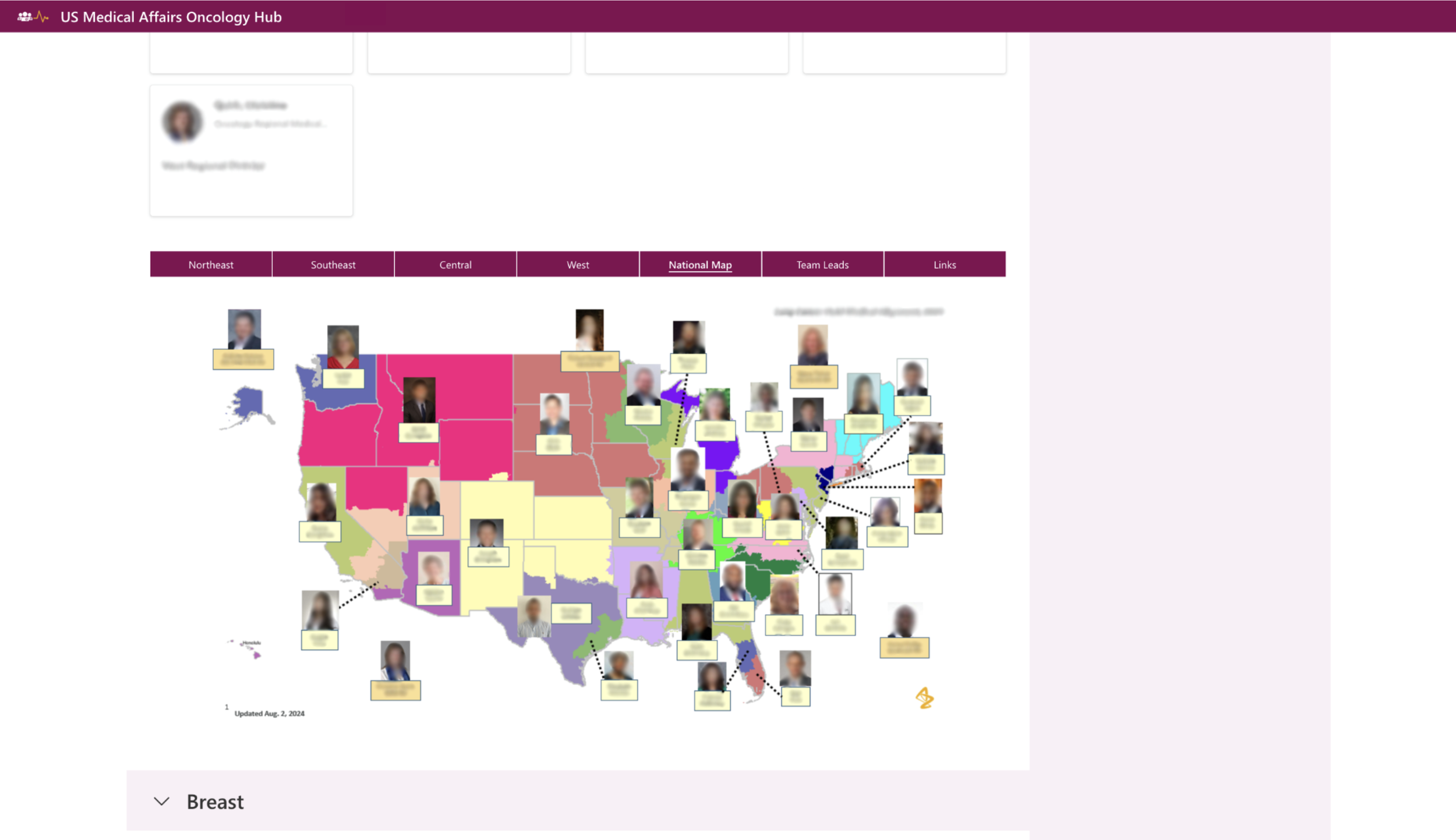
The Hub used to be difficult to navigate and lacked access to key links and tools. It contained too many pages (ex. a page for each franchise while many franchises had no use for their own page), lacked visual appeal, and because of a lack of site maintenance, users barely visited it.
UX Research Process
To conduct research for the Hub makeover, I met with Executives, Managers & Field employees and teams to understand each department & franchise’s needs. As I collected information on each group’s priorities, I created prototypes in Figma and the SharePoint Development Hub, presenting my progress as time went on. Once I solidified the content and format necessary in the Development Hub, I was able to migrate the final design to the final SharePoint Hub.
The Final Product


Solution & Implementation
For this project, it made sense to make three main pages outside of the home landing page: A page for the Field team (“Field Central”, as seen on the top right), a Headquarters page, and one-go link to an Onboarding page. Thus, I deleted all individual (and unnecessary) franchise pages and gathered all content necessary for the Field and HQ pages. Throughout the process, teams like HQ’s Finance Team and Project Management Team — teams of people that work directly with one another, rather than grouped by an overarching franchise — requested individual pages to consolidate all their content in one spot. Through various meetings and discussions, I implemented these individual pages, prioritizing user happiness and functionality along the way.